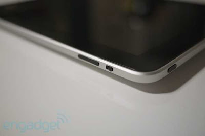
Apple iPad 3g and wifi .There are a few new components present in the iPad UI which shows that Apple has put some effort into expanding the language of this OS.
Besides those quirks we've come to know, love, and / or gripe about on the iPhone, the company has augmented the existing user interface with a small handful of tools. Before we talk about the overall feel of using this device, we wanted to break down those new elements:
* Pop-overs (modals): Windows which pop up and hover above the content you're interacting with, used to excellent effect within the iPod app for displaying track listings when you touch an album, or getting information on books or music to purchase in the iBookstore and iTunes. These modals have their own navigation and points of interaction separate from the main content you're working with.
* Split screens: Exactly what it sounds like. Apple is using all that big real estate to break up what would have been multiple pages on an iPhone, dividing up the content into segments of the same screen. In the mail app, that means you can look at the list of your emails while keeping a message in view, or keep your multi-page work in Keynote available to you even when editing (think how Preview handles a folder of images).
* Tap-and-hold: Now, this is present in some places on the iPhone, but Apple has really expanded its use with the iPad, offering lots of situations where a long press gets you deeper, contextual interactivity and functionality. We're big fans of this gesture on other devices (hello, Android), and it's nice to see Apple putting it to better use within the iPad's UI. We hope this trend continues throughout the company's mobile OSs.
* Contextual menus: While tap-and-hold gets you some options for context-specific menus, the iPad interface is littered with other single tap buttons that pop open those same kind of options. The shift certainly seems to be towards these transient menus as opposed to paging through screens like we're used to on the iPhone.
* Toolbar drop-downs: Apple hammered on toolbar items with previous iterations of the iPhone OS, but on the iPad, toolbars aren't just links to deeper pages -- they're self-contained menus, often with lots of levels and options for tweaking the work you're doing. They are literally all over the iPad.
* Tabs (or Cover Flow) everywhere: You know how Safari handles multiple pages? Well that behavior is used throughout the iPad to navigate through files or lists of options. In Safari, as in other apps, the content is presented as a grid, while elsewhere it's a scrollable list akin to Mobile Safari's present use (or webOS cards).
* Nearly full-sized virtual keyboards: In portrait mode, we were able to tap out some messages using our thumbs, but we mostly did single finger typing. On the other hand, the landscape keyboard is big and totally usable. In fact, we were surprised at how quickly and accurately we could bang out emails on it.

Apple iPad 3g and wifi photo


